DARKTIDE


Internship May to December 2025
Engine: Stingray
The internship
I had two roles during my internship at Fatshark - Lighting Artist and Level Designer.In lighting I worked on three projects:
- Bound By Duty
- No Man's Land
- Ember mode for existing missionsIn level design I worked on one project that's unannounced.

Lighting Art
Bound By Duty
Bound By Duty was the first project I was a part of during my internship.We had references from an already existing mission from the game to use as a guideline.To me as a lighting artist that meant analyzing:
- Fixtures
- Light color
- General color scheme
- Lighting designAfter doing this I created a rough concept with sketches, applied them and adjusted when needed.
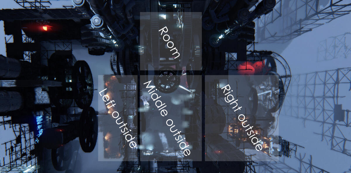
There are 4 areas in this level - left outside, middle outside, right outside and room.
Middle outside
I started off by placing DDGI volumes and reflection probes to cover the entire player area.

The middle outside area is where you start and end the mission, so I wanted this to feel impactful and memorable.I highlighted the big machine in the middle and the smaller one in front of it since these are the units that I feel makes this level stand out from the rest.The tubes on the smaller machine got lost a bit, so I highlighted them with spotlights for a rim light effect as if it came from the spotlights on the side.
Paths between areas in red light color to increase readability.I placed the fixture to create interesting shadows from the ice.
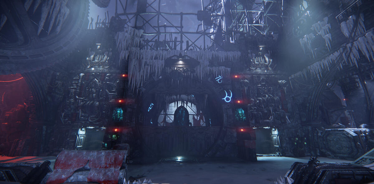
The art direction for this level is based on a pre-existing mission, so I chose fixtures from and based the color scheme on that mission.
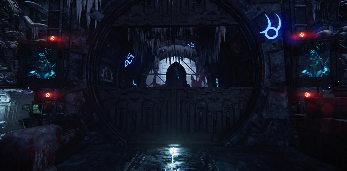
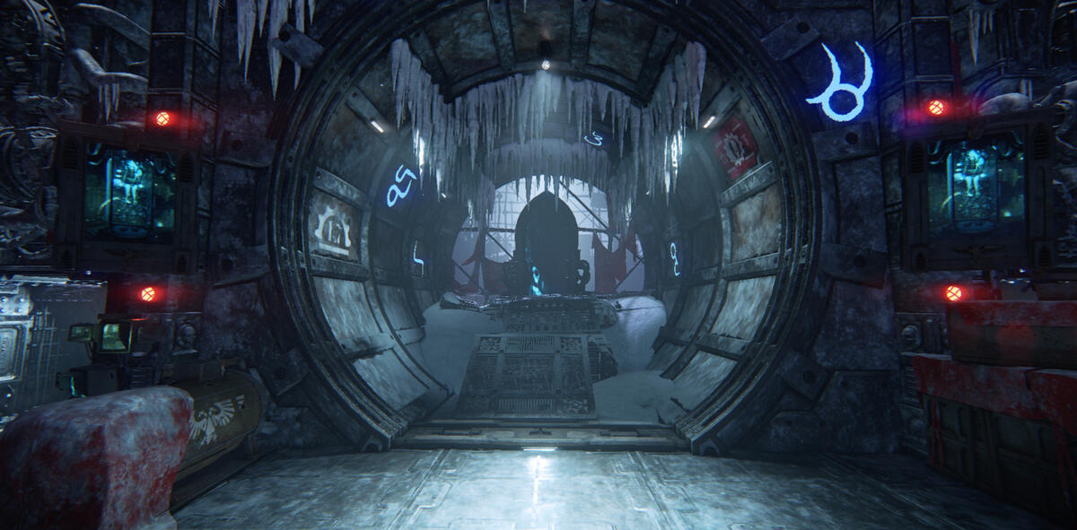
I wanted the door at the end of the level to have a different type of lighting setup than the rest, so I increased the volumetric fog and put a spotlight behind it to create a strong silhouette.
When the end event is cleared, I wanted to guide the player and make the environment feel more alive, so I scripted some lights to switch on.
Left outside
I wanted to differentiate the different areas, so I chose a warmer color for the fixtures to frame the area.Here I also use mainly linear fixtures in contrast to the rounder shapes in the middle area.
I wanted to highlight the area where the enemies spawn (the entrance in the middle of the picture), so I put lights at the sides.Since they frame the player area these fixtures were also linear.
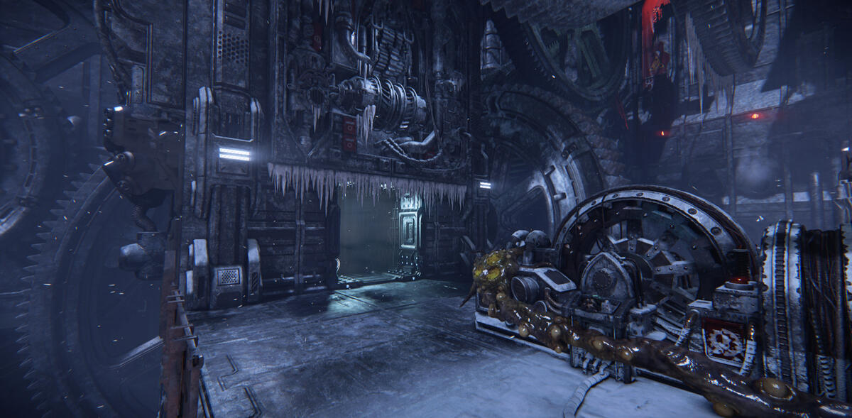
I added a flickering light to enhance the feeling of this place being left behind.
Right outside
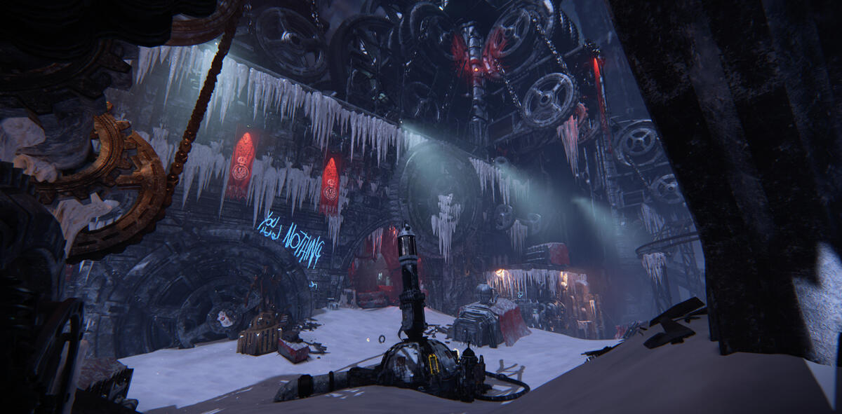
Similar to how the left part's round fixtures ties back to the middle part, I wanted to do the same in this area with the spotlights and the fixtures highlighting the red banners.
This area is a bit more chaotic, so I wanted to change approach in how the other areas had been lit up.I highlighted the machine and the building where the enemies spawn from, and then I let the sun shadows get more space.If there are sun shadows in a level I always try to preserve and enhance them as long as they serve a purpose.
Room
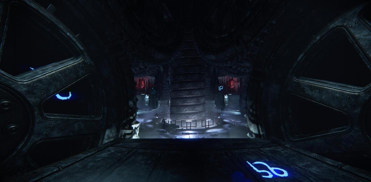
The room differs a lot from the other areas. Not only in appearance, but it also has an event where you have to blow up the ice that has stopped the machinery from moving.This had some interesting architecture to work with. I lit the big drill in the center from underneath to contrast the lighting in the rest of the level.
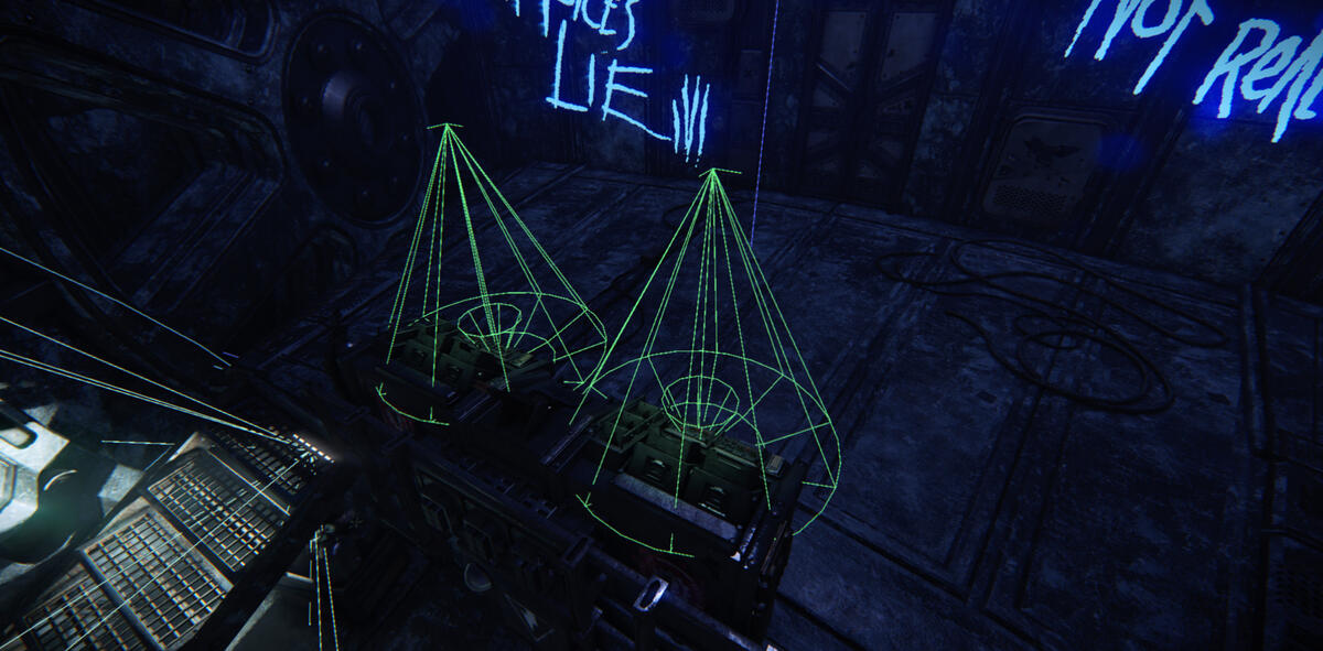
Small, green, none shadow casting spotlights on the dashboard to make the displays pop.
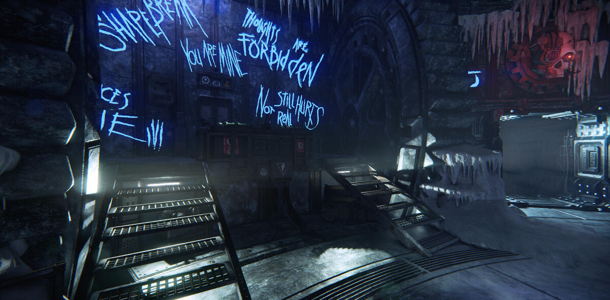
Static shadow casting lights underneath the stairs created interesting shadows and also framed the area in a nice way.
Visual Scripting
Scripting for when the ice has been removed from the cog wheels and the player has pulled the lever.I wanted this achievement to give some payoff, so I made this sequence of lights turning off and new ones turning on.
I made a few iterations. Here are 3 of them.It was an exciting process to discuss with the sound designer what it could sound like when the lights turned on and off.
Optimization
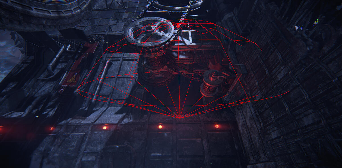
One spotlight to light up surrounding area instead of four.
I flipped the spotlight to light up the area better. I use these solutions in places the player can enter, and when the light doesn't affect the volumetric fog.
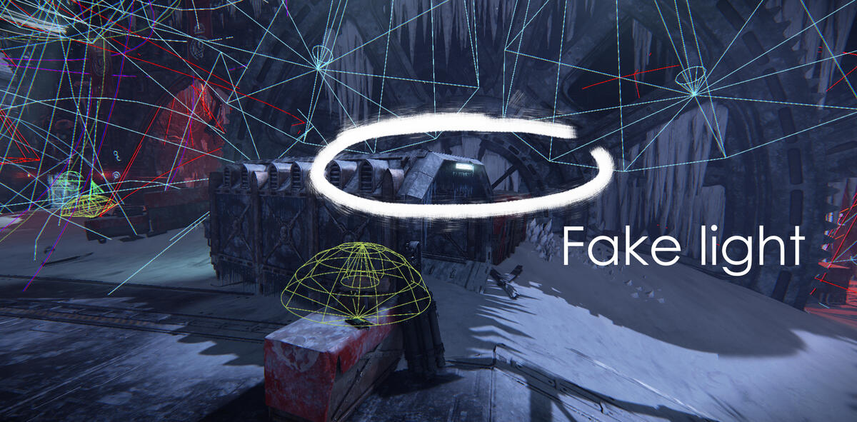
If I want to achieve a certain look, but want to keep it as optimized as possible and if the light doesn't really add anything to the space, I sometimes turn off the light and keep the emissive material on the fixture.The light would blur out the interesting shadows created by the sun, so it made sense to turn the light off in this case.
Ember

Ember is a game mode in Darktide where the area is taken over by enemies with flamethrowers. The setting is dark with mostly warm tones from fixtures and fires.My task here was to help guiding the player, and to enhance the mood of Ember. The contradiction between darkness and guiding the player was an interesting and fun challenge.In addition to the lighting, I also adjusted and added fire VFX. I talked to the level artist about his approach to make sure I kept his vision, and when possible, enhanced it. He focused a lot on silhouettes, so I kept this in mind when I started working on the level.
1st Level
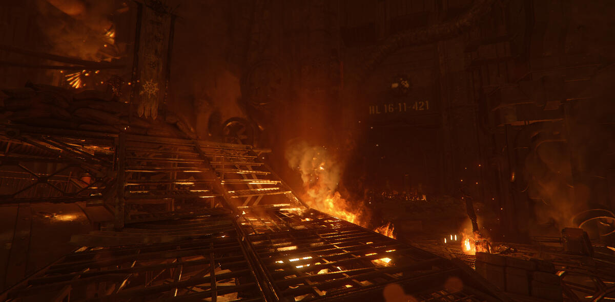
Rays from fire. I wanted to create fog rays, and placing them near these grid patterned bridges was one way to do it.
Shadows from ceiling. I try to find different ways to vary the lighting, and by working with shadows opens up a lot of possibilities. But I keep performance in mind, both in overlap to other light sources and in the spotlight's shadow resolution.
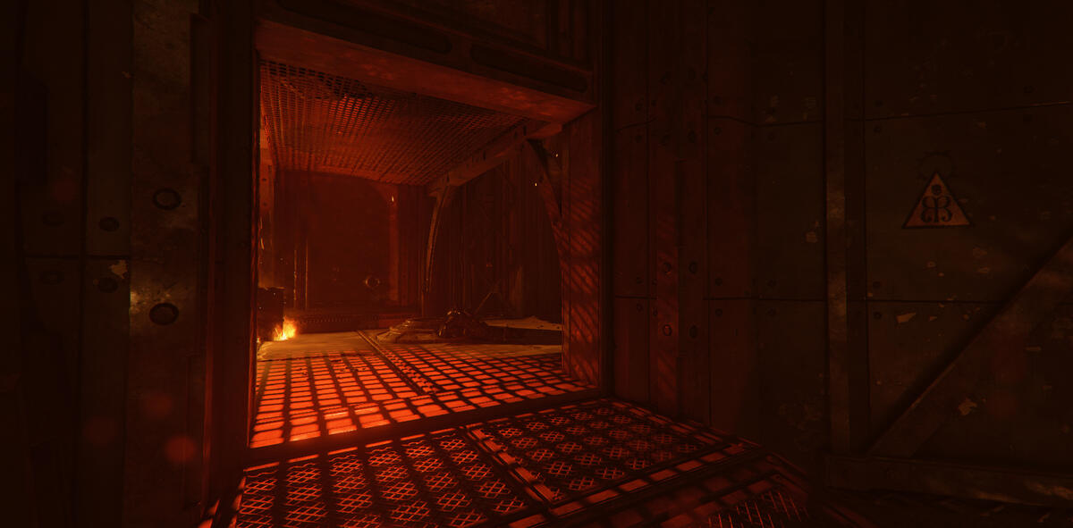
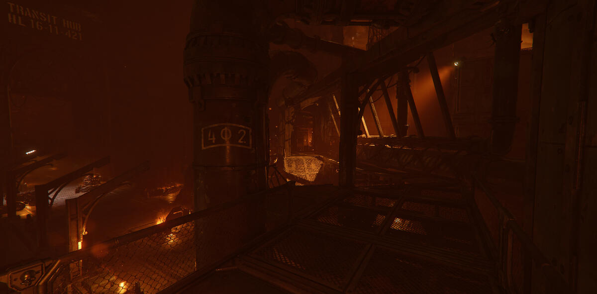
Spotlight direction providing guidance, and volumetric fog behind the pillars creating depth.
Fog rays to pull focus to this area. Guiding with fixture in different light color to stand out.
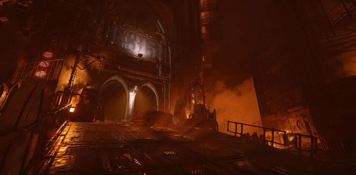
Finding places to place lights to create interesting shapes.
Red light for subtle guidance. It's in the warm part of the color wheel, but still stands out from the yellow and orange.I also saw an opportunity to create interesting shapes with the light here.
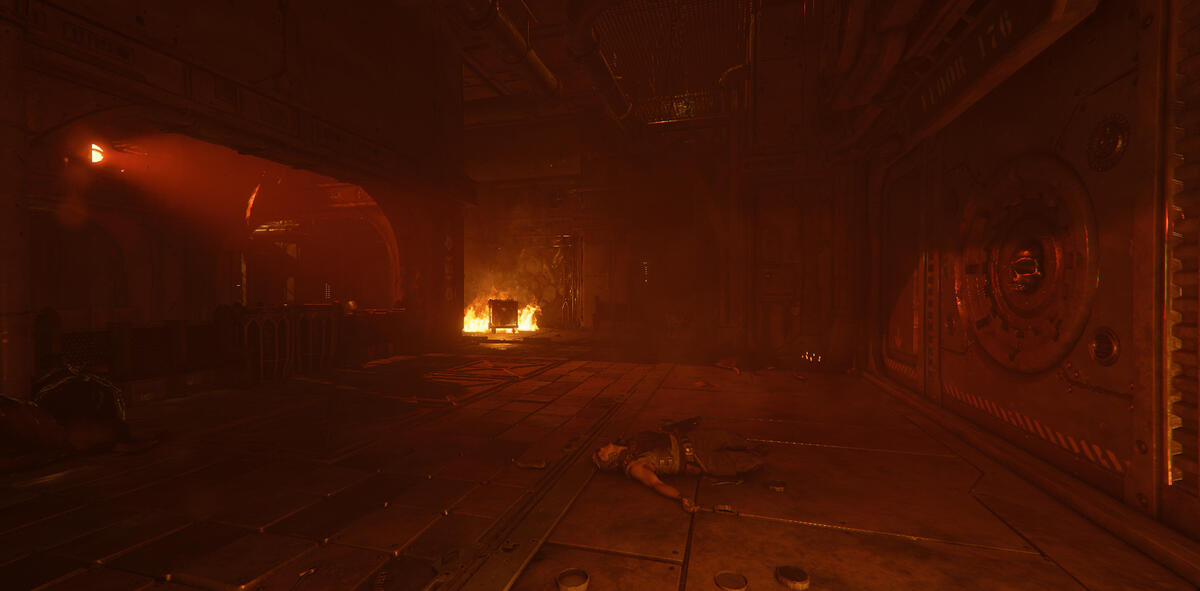
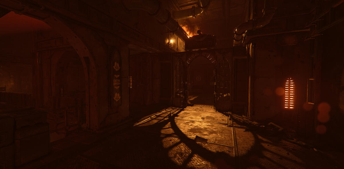
Interesting shapes from shadows from the fire. The idea is to pull the player's focus towards this area since this is where you open the gate in the previous picture.
Guiding light color and interesting shadows.
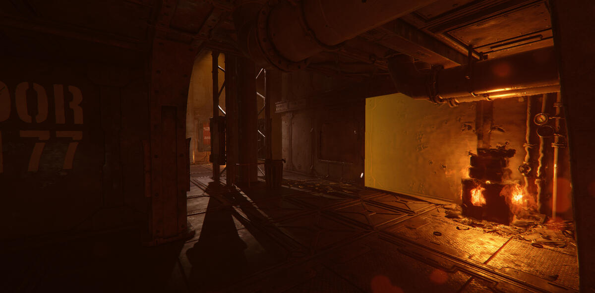
Repeating pattern with light under stairs.To create consistency, I use repetition as much as I can and just a few design elements.
Creating counter shapes to the angled walls with fog rays.
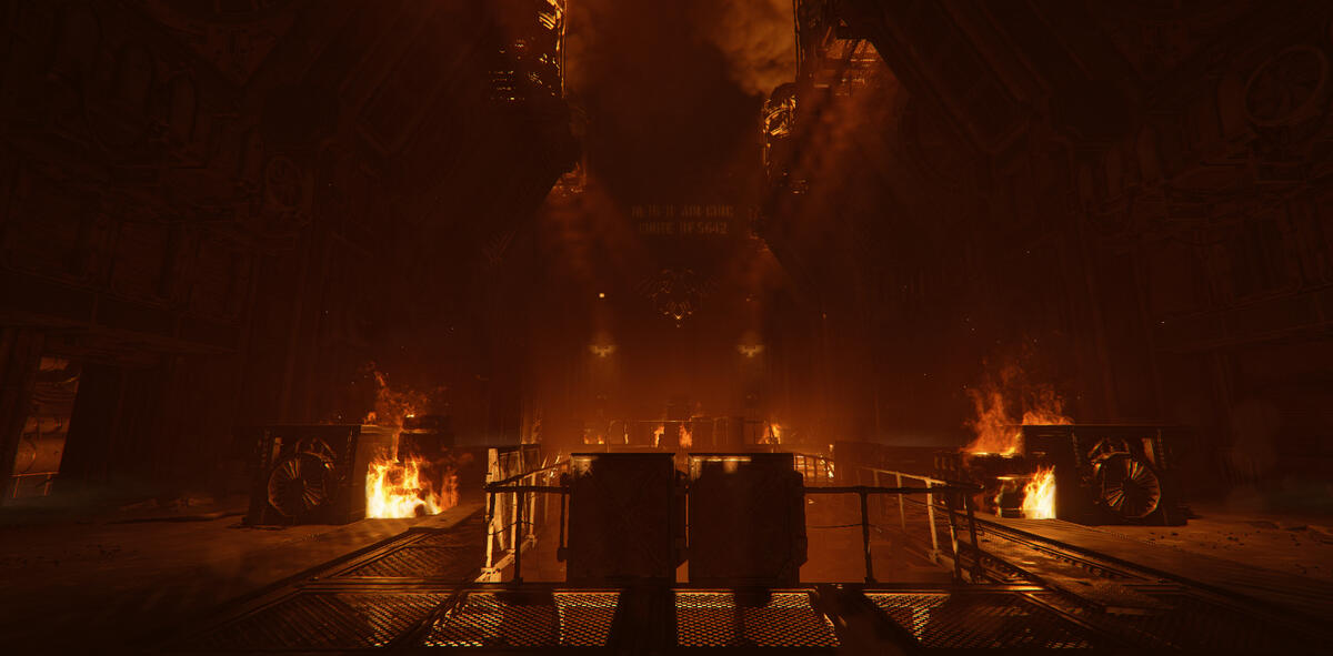
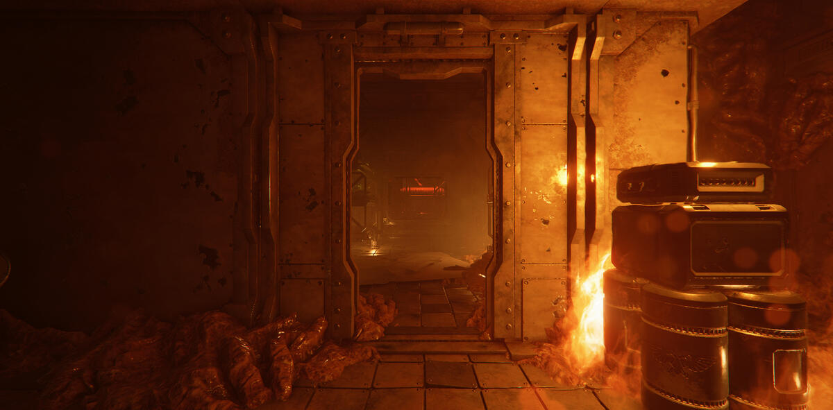
Red guiding light at the end of the area. This place was a bit tricky to navigate, so I wanted to highlight and guide the player forward.
This same area as mentioned above also made it possible to create interesting shapes with the shadows.
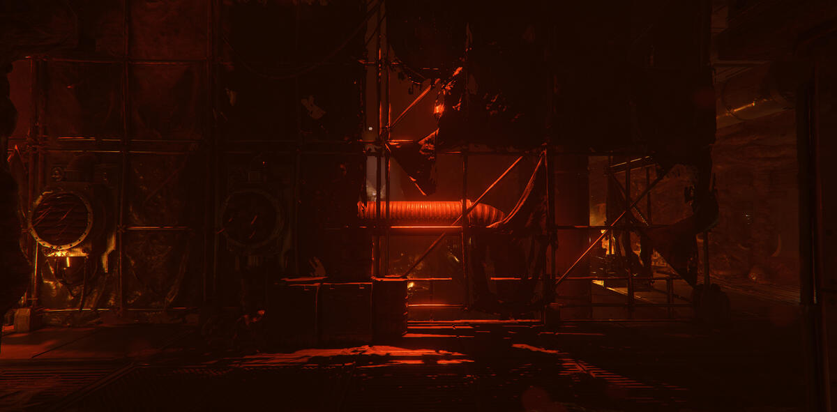
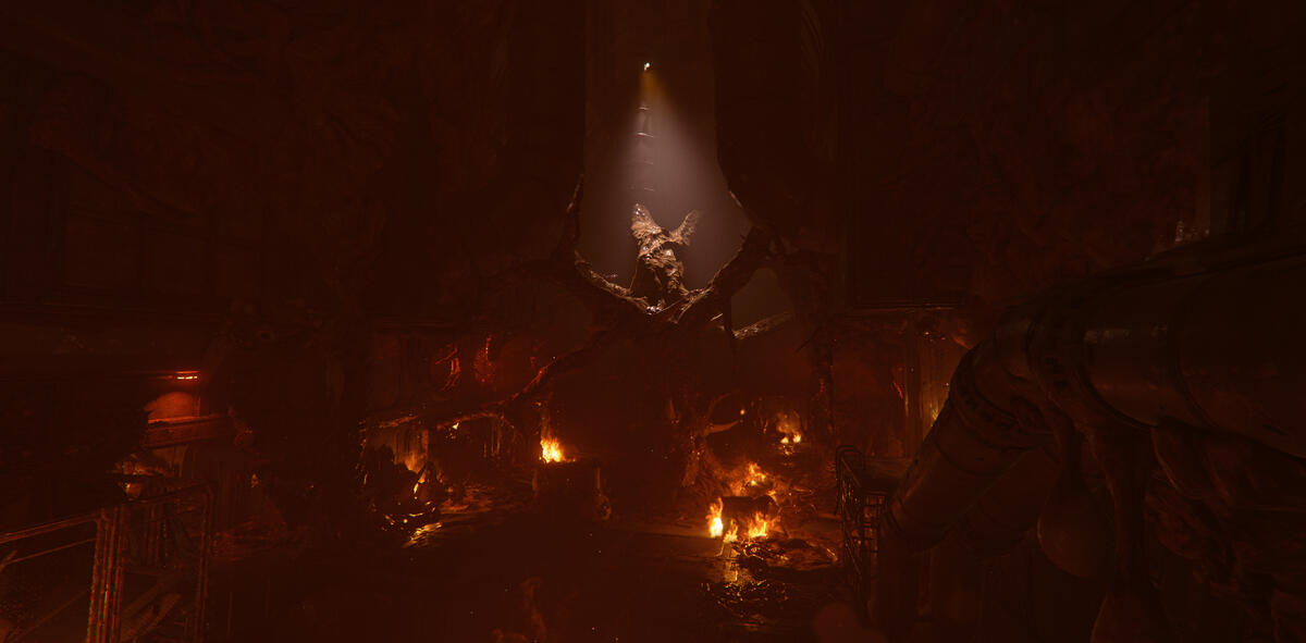
This was a vista that I wanted to highlight extra, both for it's striking esthetic and since an event happens in this area which creates a variation in pacing.I wanted to create an aggressive impression, to enhance the danger. I did this with hard shadows created by one key light and no proper fill light. Also, I increased the volumetric fog to give the unlit "arms" a silhouette.
I enhanced parts of the architecture I found interesting to create a sense of space for the player.
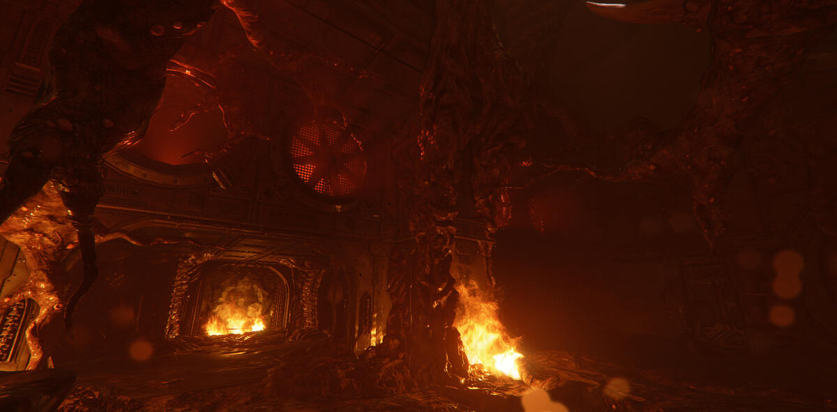

This was a vista that I wanted to highlight extra, both for it's striking esthetic and since an event happens in this area which creates a variation in pacing.I wanted to create an aggressive impression, to enhance the danger. I did this with hard shadows created by one key light and no proper fill light. Also, I increased the volumetric fog to give the unlit "arms" a silhouette.
Big light shapes on big paths to keep harmony and a sense of direction.
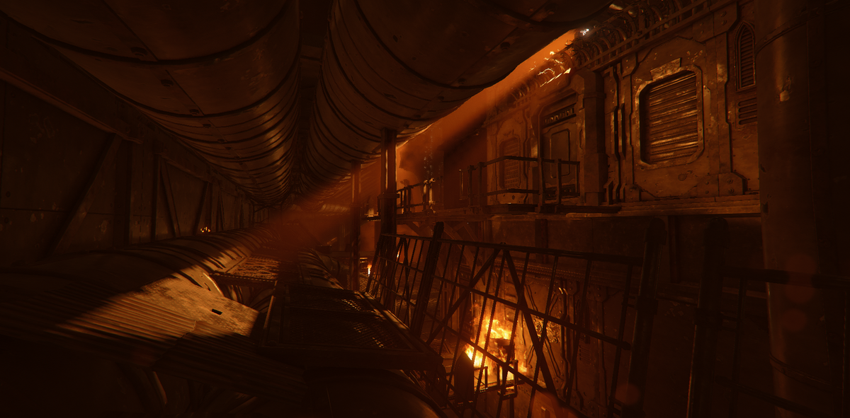
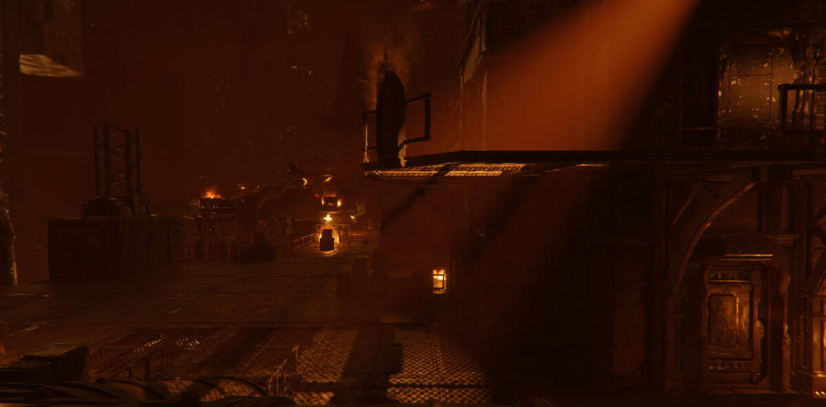
Guiding direction of light that also created interesting fog rays and shadows.
Embers falling from the fan to communicate that there's a fire above. It also creates movement in the shadows which makes the space feel more alive.

2nd Level
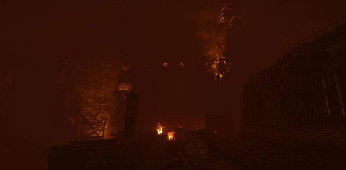
Fire in surrounding area to expand the space.
Guidance with fixture with different light color than the rest in the area.
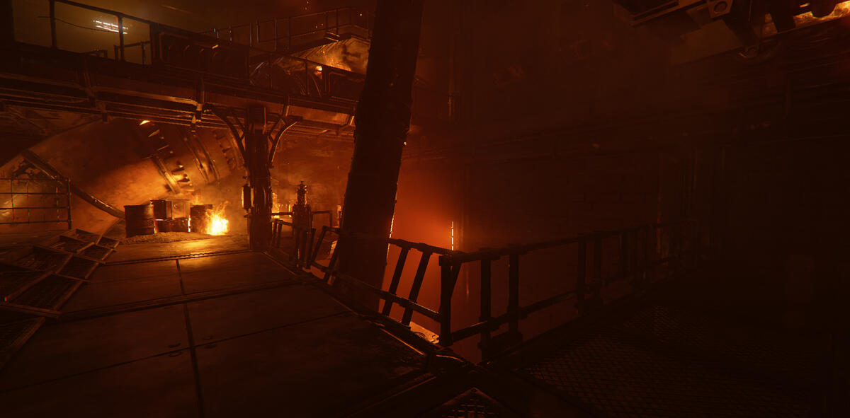
Sometimes I like to use silhouettes rather than lighting up the object, like this fence for example.
Here's another example of silhouettes. I wanted to enhance the architectural elements with the arches.I try to keep the lighting design as simple as possible. In this case all that was needed was a single spotlight with high volumetric fog to enhance the silhouettes, and some fires along the way for movement.
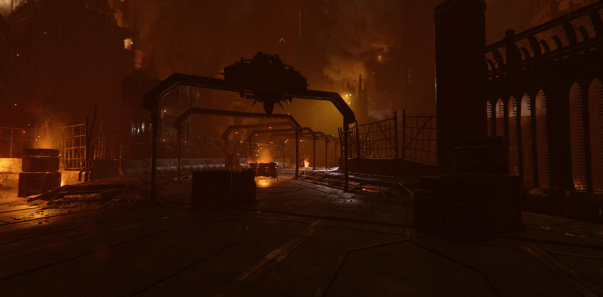
Volumetric fog to enhance guidance.
When I see something that makes a mark on the environment I generally try to highlight it. In this case it also was the way forward, so it supported the purpose of guiding the player as well.
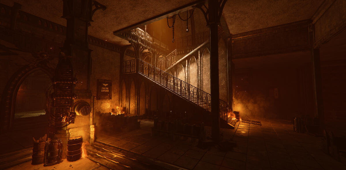
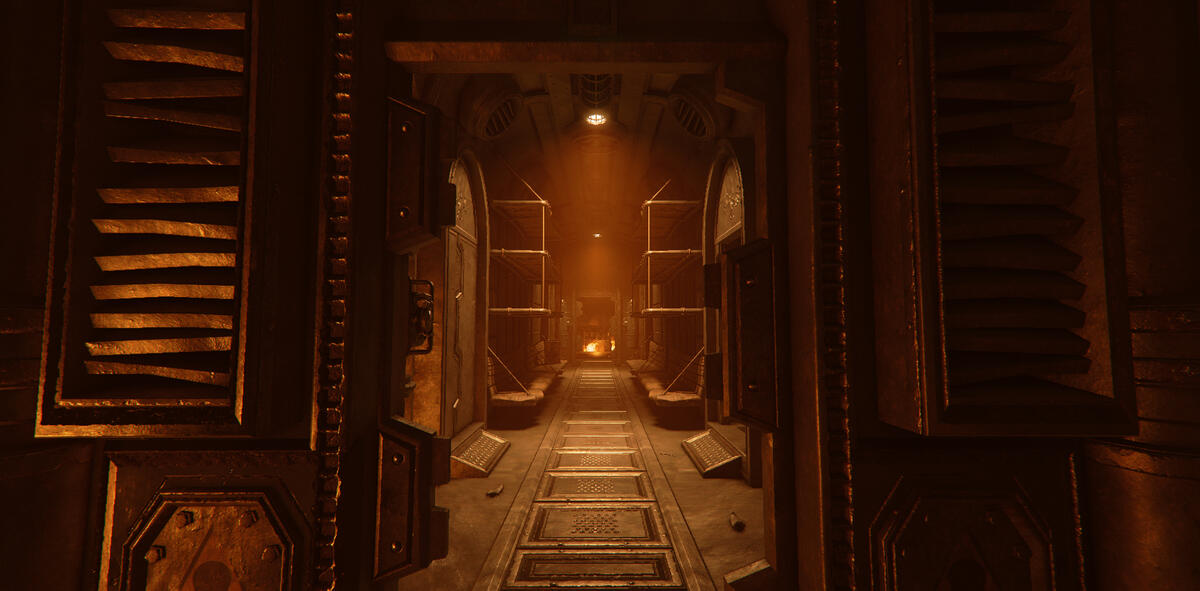
Sometimes simple lighting design is enough if it's placed correct.This space didn't really need more than a fixture in the roof. The shelves contrasts against the dark walls behind them. The shadow on the frame of the doors on the side highlights the shape.
Complex shadows created by a spotlight from outside through the window. White light color to guide the player.
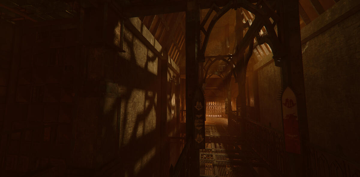
Boss arena. I brought out the architectural elements I felt stood out and made this space feel big, since it's the last area in the level.I created a counter shape to the valve pillar with a spotlight on the wall beneath it.
Fire behind the trains created a silhouette for them and a depth to the area. It also increased the sense of urgency.
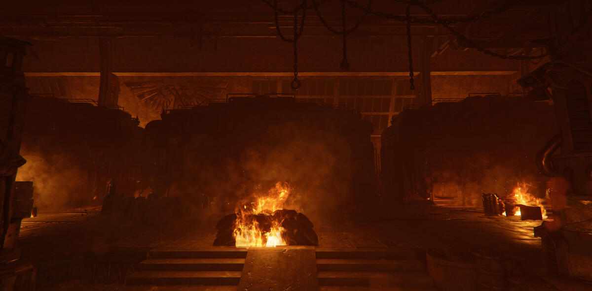
No Man's Land
This is a project I worked on from August to October. You play through a war zone alongside a tank that blows up walls and enemies throughout the level.
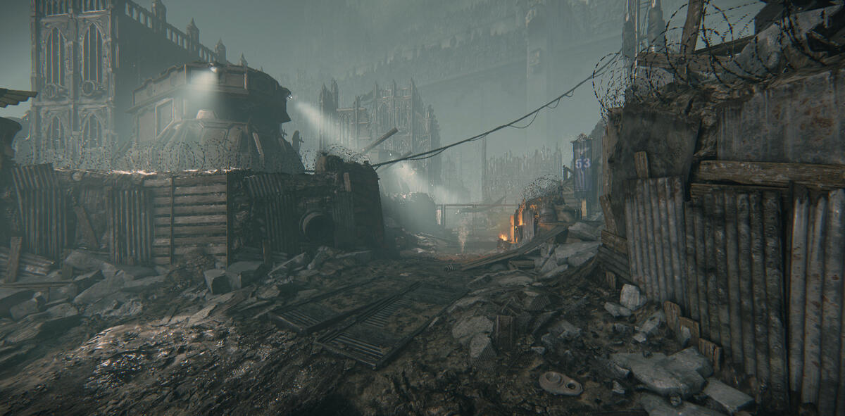
I didn't want to add too much light to the ground at the start of the level, so I worked primarily with the volumetric fog, making sure it felt natural where the light came from.
To make the level feel more dynamic, I added fire as a color contrast to the blue/grey tones of the color grading.
Fixtures in the same linear shape language as the bridge.
The light from the lantern creates depth to the pillar in front of it.
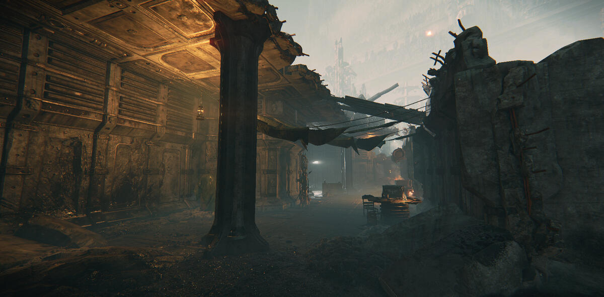
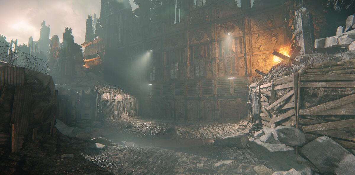
This is the end of the first part of the level. There was this massive wall that I felt needed something more than what the player had seen so far, so I added big spotlights from a higher point, lighting up the entire area.It is however the fixtures below that's making the light for the area, the spotlights cast light only a few meters for optimization.
Spotlight placed to create interesting shadows.
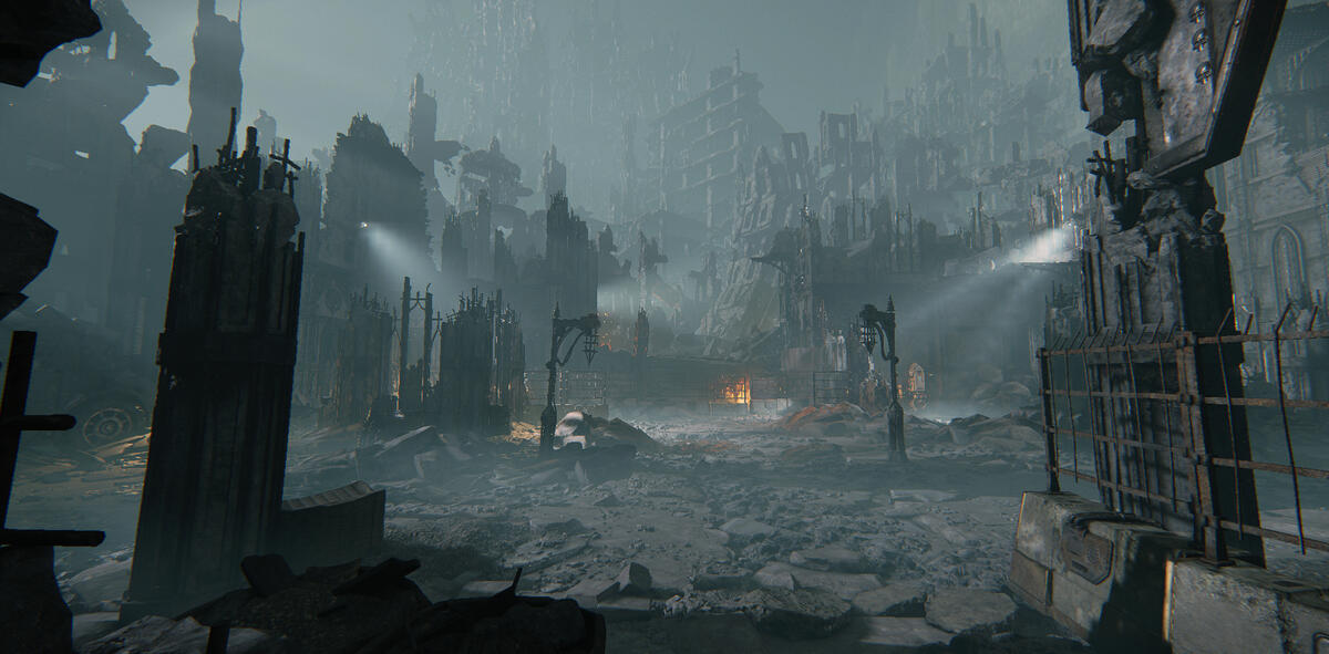
The next area opened up to an impactful vista. It was quite flat however, so I focused on enhancing silhouettes and creating depth.
Since this is the area before a battle field, I wanted there to still be some fires here. This window created an opportunity to guide the player, and also create interesting shadows and fog rays.

Live shadow casting fixture to create interesting shadows behind the enemies (placeholder enemies in the picture for demonstration's sake).
Level Design

Project still in production, therefore this part will be empty until release.

